

If you’ve ever Googled a lawyer, you know the feeling.
You click the first result, land on a website that looks like it was built during the Obama administration, squint at tiny grey text on a white background, try to find a phone number, give up, and go back to Google.
Then you click the next one. Same thing.
It’s 2026, and the legal industry has one of the most consistently outdated digital presences of any professional sector. Not because lawyers aren’t smart — obviously they are. But because most law firms have spent decades winning clients through referrals, reputation, and relationships. The website was an afterthought. A digital business card nobody really needed to read.
That era is over.
The Numbers Don’t Lie
Over 70% of people looking for legal help start their search online. Not through a referral. Not through a Yellow Pages ad. Online.
And when they land on your website, you have approximately 3 seconds to convince them to stay.
Three seconds to communicate credibility, competence, and trust — the three things every person hiring a lawyer desperately needs to feel.
A website with outdated design, no mobile optimization, and a “Contact Us” page that’s just an email address is not communicating any of those things. It’s communicating the opposite.

What a Bad Website Actually Costs You
Let’s be concrete about this, because lawyers appreciate precision.
Say your firm brings in 20 new clients per month through referrals. Your average case value is €3,000. That’s €60,000 per month — a comfortable practice.
Now consider: how many people Googled your firm name after getting that referral, landed on your website, and quietly decided to call someone else instead? Even if it’s 15% of referrals — that’s 3 clients per month, €9,000, gone. Not because you weren’t qualified. Because your website didn’t look like you were.
And that’s before we even count the potential clients who never got a referral and found you through search — and immediately left.
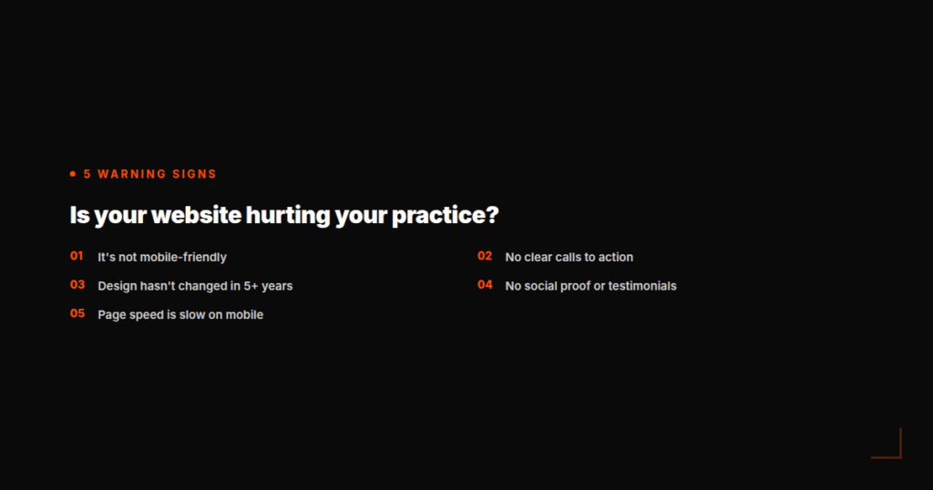
The Five Signs a Law Firm Website Is Hurting the Practice
- It’s not mobile-friendly. Over 60% of web searches happen on a phone. If your site isn’t optimized for mobile, Google actively buries it in search results — and the people who do find it leave immediately because it’s impossible to navigate with a thumb.
- There are no clear calls to action. “Contact us” buried in the navigation menu is not a call to action. A prominent “Book a free consultation” button on every page is. People need to be told exactly what to do next — especially when they’re stressed, which is almost always the case when someone is looking for a lawyer.
- The design hasn’t been updated in over five years. Design communicates trust before a single word is read. An outdated design signals an outdated practice — even if that’s completely untrue. Perception is reality.
- There’s no social proof. Testimonials, case results, press mentions, association memberships — these are the digital equivalent of a well-decorated office in a good neighborhood. They tell the visitor: other people trusted this firm, and it worked out.
- Page speed is slow. A website that takes more than 3 seconds to load on mobile loses over 50% of its visitors before the page even appears. This is a technical issue, but it’s also a revenue issue.
Why Lawyers Keep Putting This Off
The most common reason we hear from legal professionals is time. Running a law firm is all-consuming. Between client work, court dates, and managing a team, “redesign the website” never makes it to the top of the priority list.
The second reason is trust. Who do you hire to build something this important? A freelancer who might disappear? A big agency that charges €20,000 and delivers something generic?
The third reason — and this one is the most honest — is that many lawyers simply don’t realize how much business they’re losing. When clients come in through referrals, it’s easy to assume the website doesn’t matter. But the data says otherwise.
What a Great Law Firm Website Actually Looks Like
It doesn’t need to be flashy. Legal clients aren’t looking for creative — they’re looking for confident and clear.
A great law firm website does five things well:
- Communicates the practice area immediately — within the first five seconds, a visitor should know exactly what kind of law you practice and who you serve.
- Makes contact effortless — a visible phone number, a simple contact form, and ideally a calendar booking tool.
- Shows the team as humans — professional photos, brief bios, areas of expertise. People hire people, not firms.
- Loads fast on mobile — non-negotiable in 2026.
- Builds trust through social proof — client testimonials (anonymized if necessary), years of experience, notable cases or press coverage.
None of this is complicated. But it requires intention — and it requires working with people who understand how design and digital behavior intersect.
The Competitive Advantage Is Right There
Here’s the opportunity hidden inside this problem: because most law firms have neglected their digital presence, the bar is remarkably low.
A clean, fast, mobile-optimized website with clear messaging and a strong call to action will immediately put a legal practice ahead of 80% of its local competition — without any advertising spend.
In a saturated market where every lawyer claims to be experienced and trustworthy, the firm that looks the most credible online wins the client who was referred to three different lawyers and is deciding who to call first.
That client calls the one whose website made them feel like they were in good hands.
Ready to Stop Losing Clients to a Bad Website?
At Not So Basic Media, we build websites for professional service firms that need to communicate credibility, convert visitors into leads, and work as hard as the people behind them.
We specialize in clean, fast, mobile-first design with clear messaging — built for businesses where trust is everything.
If your website hasn’t been updated in the last three years, or if you’re not sure whether it’s working for you or against you, let’s talk.
Get in touch for a free website audit →
No commitment. Just an honest look at what your website is — and what it could be.